WBC logo proposal

Branding · Logo Design · Visual Identity

reconnecting heritage with a new vision for packaging

Context

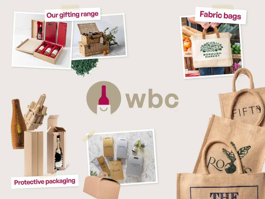
WBC (Wine Box Company) started as a specialist in wine bottle packaging but has since expanded into a much broader range of packaging solutions, from protective shipping boxes to corporate gifting and retail displays. Now part of Premier Paper Group, the company had developed a distinctive and creative DIY-inspired branding, built around cut-out imagery, taped photography and paper-inspired colours. However, its existing logo no longer reflected this personality or the evolution of its business. As part of the in-house creative team, I proposed a new direction to bridge that gap.

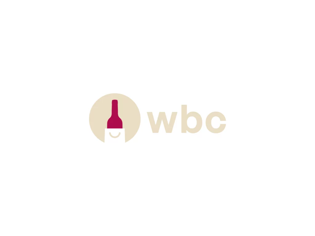
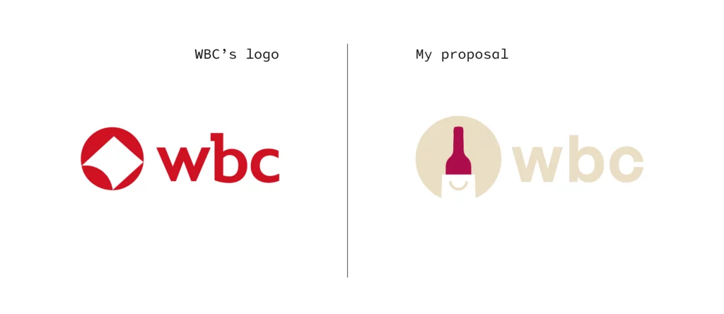
A logo rooted in heritage

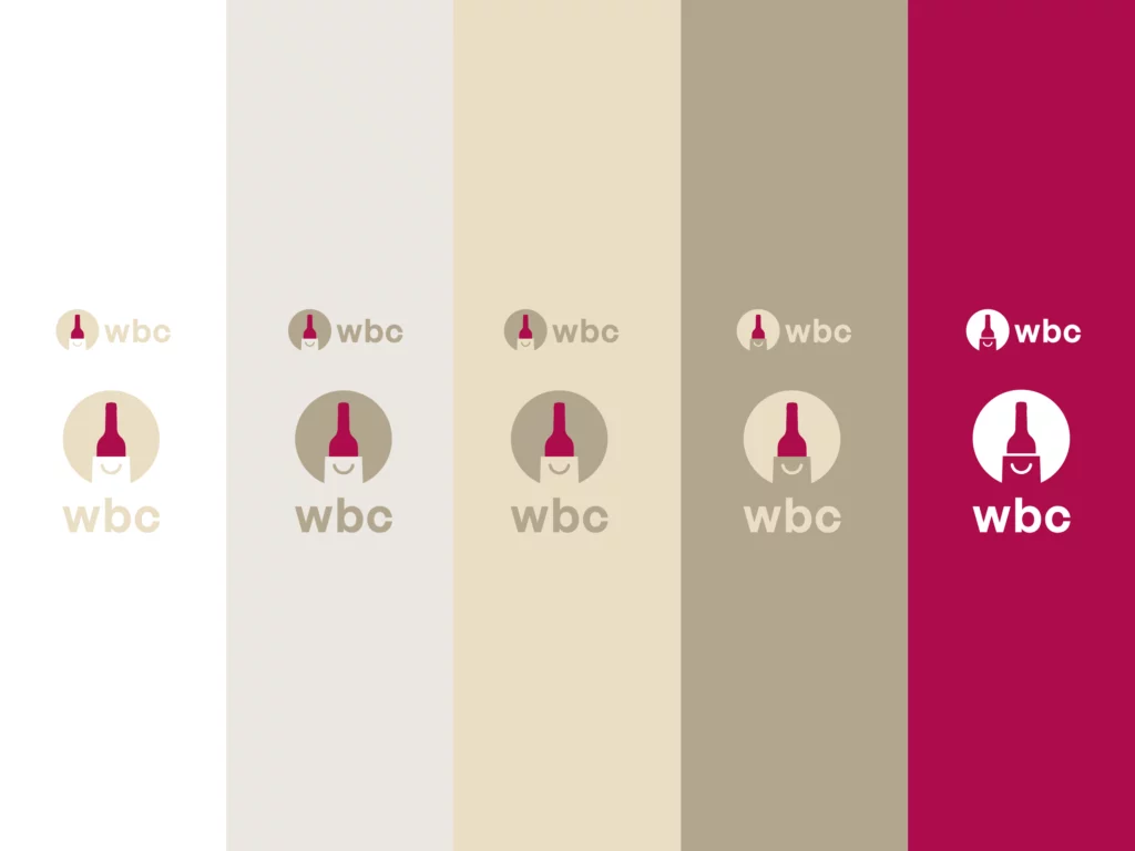
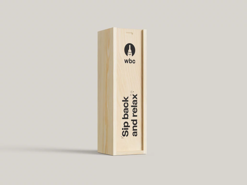
My proposal brings the bottle back to the centre of WBC’s identity, celebrating its heritage without restricting the brand to wine. The icon combines a bottle with the idea of unwrapping a gift, placing packaging and gifting at the heart of the brand. A deep burgundy replaces the traditional red, offering a subtle reference to wine and a more refined look. The typography aligns with the company’s existing branding, while the clean, modern design reinforces WBC’s digital-first nature as an e-commerce business.

A clearer strategic positioning

The new identity positions WBC as an established online packaging specialist rather than simply a division of a larger group. It reasserts the brand’s own heritage and personality while reflecting the credibility of its place within Premier Paper Group. Its contemporary aesthetic also reinforces its digital positioning, giving the company a more distinctive identity in line with its business ambitions.
A distinctive visual language

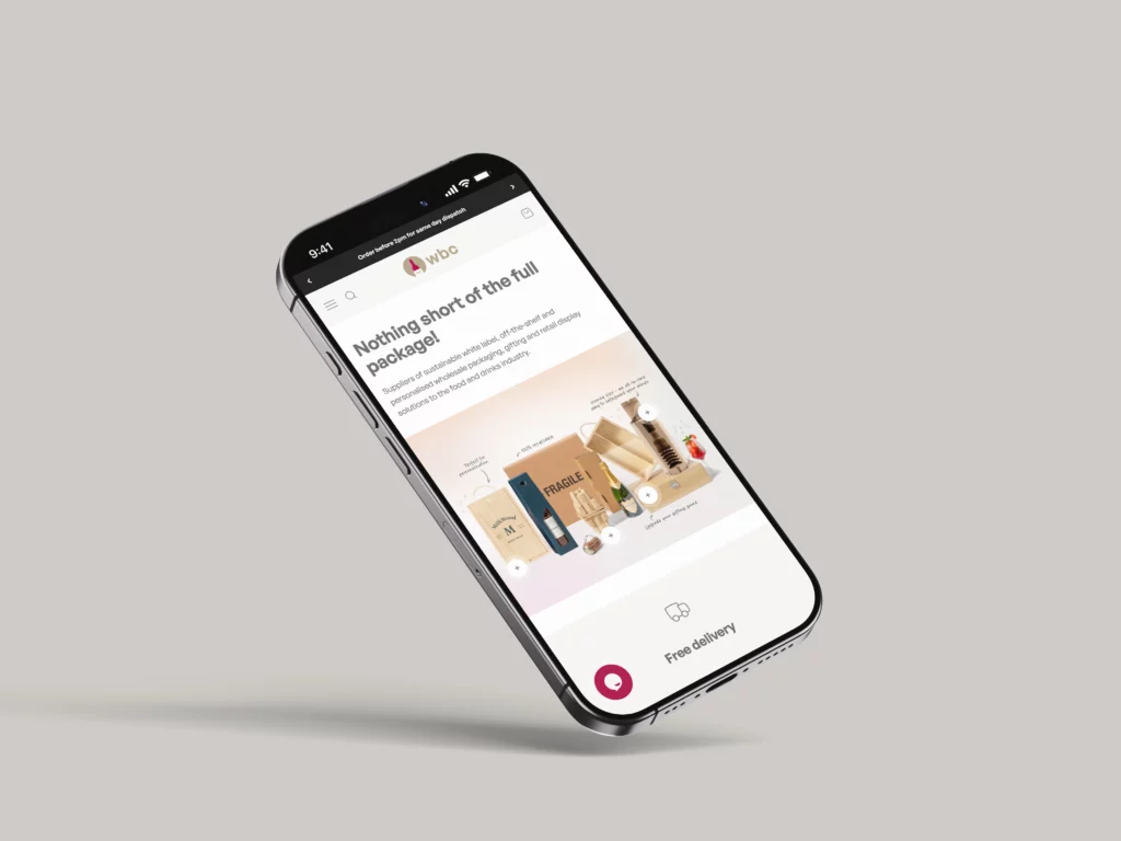
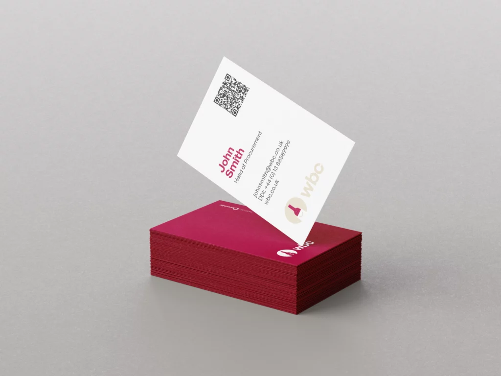
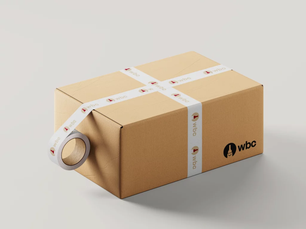
Designed to work across digital platforms, packaging and promotional materials, the logo provides a strong and recognisable visual signature. Its simple icon, burgundy colour and typography create a versatile foundation that complements WBC’s existing DIY-inspired creative language while bringing greater consistency and character to the brand.

Outcomes

The proposal received positive feedback from the creative team but was ultimately not implemented. Following a strategic shift, Premier Paper Group decided to make WBC its dedicated packaging division, moving towards a more integrated identity that placed greater emphasis on the parent group. Although the project did not reach production, it offered a strategic alternative to reconnecting WBC’s visual identity with its heritage and evolving positioning.